Name-Dropping: Big Brands Evolve to Brand Symbol

In this fast-paced, digital environment, where consumer attention in crowded fields is considered both precious and very short, many big brands have opted to remove their names from the brand mark, or shorten or retool brand names entirely.
Many reasons feed into this strategy. With mobile devices at the forefront of marketing, space and time spent are at a premium. More and more communication is transmitted through icons and symbols. Architect Ludwig Mies van der Rohe’s axiom “Less is More” has never held more true. Flexibility in design allows visuals to work seamlessly across the digital landscape which requires complete visual and experiential adaptation from sizes and shapes of screens to platform needs.
A Symbol is Worth a Thousand Words
In the exalted category of iconic, Apple’s mark is a visual representation of the company name – it’s not a stretch to see why the company chose the symbol path decades ago. Likewise, Target de-coupled the name from its symbol in the mid 2000s. Nike’s Swoosh has been around since the early ‘70s, separated from its name in the mid ’90s, and is so ubiquitous that no name is needed. Of course, these companies have made long and steady investments in their global brands, not only in their creative elements, which never stand alone.
Recent Name-Droppers

Mastercard announced the move to the symbol-only direction by jettisoning the name from its brand mark a few months back.
The company relied on 20+ months of global consumer research to ensure that the brand was identifiable solely by its venn diagram-like circles. Raja Rajamannar, Mastercard’s Chief Marketing and Communications Officer, explains the findings:
“…with more than 80% of people spontaneously recognizing the Mastercard symbol without the word ‘Mastercard,’ we felt ready to take this next step in our brand evolution.”

QVC has recently rebranded. It is the latest company to go solo – dropping the QVC brand initials within the letterform – and move ahead only with the redesigned “Q” within a square.
As per the QVC press release, the QVC rebranded visuals are designed to capture small-screen attention and reflect the significant changes that social has brought to digital retail:
“The result is a reimagined “Q” in a sleek, mobile-friendly format and color scheme that underscores QVC’s mobile-first, social-first approach to video shopping.”
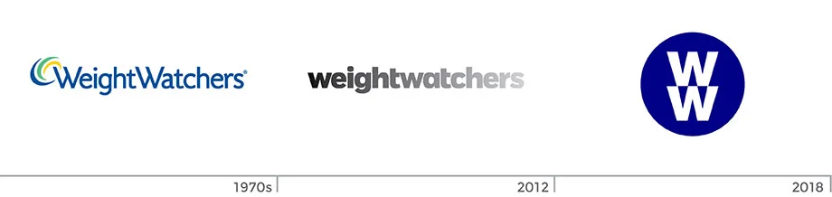
Weight Watchers shed heft – in the form of 12 letters – renaming to “WW.” In addition to the brand mark better supporting the digital landscape (I presume), Stacie Sherer, Senior VP of Communications, explains the rethink to shift the focus away from dieting to body positivity:
"What we announced goes beyond a 'rebrand.’ It is a reflection of our evolution, which began in 2015, to take a more holistic approach to overall health and wellness … to make a positive and meaningful impact on people’s lives."
In the Brand Retooling Realm

Amazon has slowly dropped the name “Amazon” from its Prime mark signifying that Prime stands as its own global brand. Prime, along with the smiling arrow and Amazon blue, has rolled out new packaging and signage.
It’s interesting that the US website still uses the parent/sub-brand mark. Perhaps the roll out is not complete, or Prime is still strongly joined to Amazon members on that platform or market.

Since “America runs on Dunkin,” logic seemed to dictate that Dunkin’ Donuts lose the sugary half of it name, especially since its biggest seller is coffee. The rebrand focuses on coffee, and retains its familiar pink/orange palette and font. Chief Marketing Officer of Dunkin’ US, Tony Weisman, explains:
“By simplifying and modernizing our name … we have an opportunity to create an incredible new energy. We are bringing the iconic name Dunkin’ to the forefront in a bold way that brings to life how we refill optimism with each cup and bring fun, joy and delight to our customers each and every day.”
Much figures into strategic brand-building. Whether the new companies’ evolution to symbol marks or reduction in names sustains and strengthens, or has any effect on the brands, remains to be seen. Stay tuned.